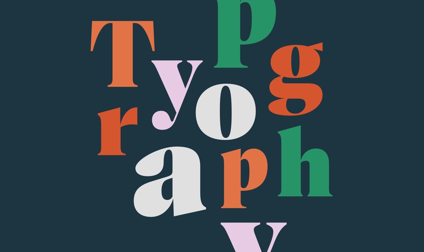
Typography gives brands a competitive advantage
New research reveals typography gives brands a competitive advantage and some people are more emotional about fonts than others.
Monotype, one of the world’s leading font and technology specialists, recently released an in-depth study on the power of different fonts to convey an emotional response.
Key findings:
- The right typography influences brand recognition
- Typography provides a sense of security to consumers
- Typography gives brands a competitive advantage
The research was conducted in the UK and in France*, and found that the French have more emotional responses when viewing typography than their British counterparts. The findings highlight both the power of typography to convey different “feelings” – and significant national differences in emotional response to type.
The research findings confirmed the hypothesis that typography, even in the absence of colour, logo, movement or any other traditional visual identity element, plays a crucial role in eliciting an emotional response from audiences.
Respondents in France reacted differently to typography than those in the UK and in general, typography provoked stronger emotions amongst consumers in France.
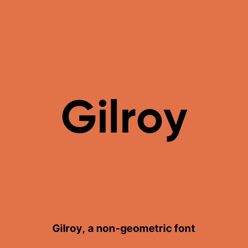
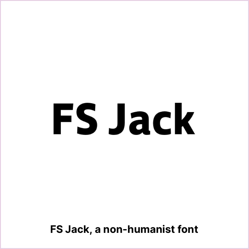
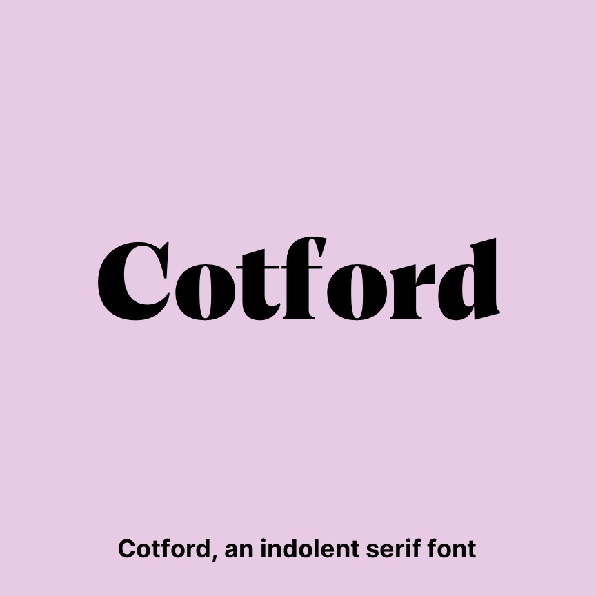
Participants were presented with three contrasting typefaces that are not currently in use by brands: FS Jack, a non-humanist font; Gilroy, a non-geometric font; and Cotford, an indolent serif font. Each typeface was applied to three types of stimuli: individual words, a sentence using these words and a sentence containing these words in reference to a brand. Respondents rated the combinations on a range of emotional measures, such as sincerity, memorability, trustworthiness or confidence.
For trust, there was a clear response – France felt more confidence (14%), honesty (5%) and sincere (8%) emotions/motivations towards the word, whilst the UK found it more innovative (9%), prominent (11%) and memorable (7%).
For quality, France found the word more honest (11%), relevant (8%), sincere (8%) and trustworthy (10%), whilst the UK found it more innovative (4%), prominent (19%) and memorable (15%).
For innovation, France found the word more innovative (9%) than the UK, but scores lower on all other emotional and motivational responses (2%-13%).
So, ‘quality’ and ‘trust’ had a greater emotional connection in France than in the UK, and innovation stands out as very important.